Yarnspin is my story-telling game engine, designed to be very easy to use, and it can run as a local build or in your browser. It is completely free (public domain) and you can find it here:
I thought it would be fun to think back on where Yarnspin comes from, and take a look at some of the games from the (distant) past that inspired me to make it.

Ever since I got my first computer, a Commodore 64, when I was 10 years old, I’ve loved games, and while there has been plenty of action games I’ve enjoyed, it’s always been story games that really grabbed me. I guess I always loved stories, even long before I played my first videogame.
Eureka!
I am pretty sure this was the first text adventure I ever played. I was only 10 at the time, and my English was very basic, so I didn’t make it very far in the game, but I remember feeling totally blown away by it, and going back to try it over and over again, just to shortly die again. The images were very simple, but being a visual person, I very much appreciated them anyway. I think this being the first text adventure I played is part of the reason I never really got into pure text based adventures that didn’t have any illustrations.
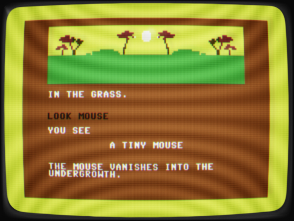
The game was in five parts that you had to load separately (if I recall correctly), and took place in various points of time in history. I remember spending a lot of time around dinosaurs and ancient romans.
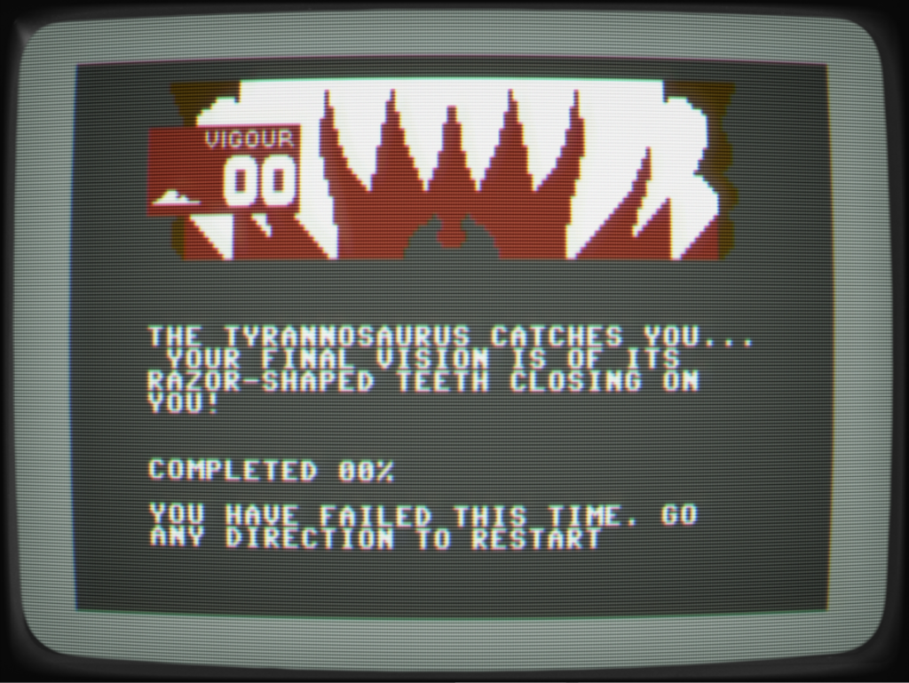
The images only cover a small part of the screen, leaving plenty of room for text. I think keeping the images small also helped making things look better overall, as I don’t think the image quality would really have worked for full screen pictures.
Spider-Man (Questprobe)
Not long after playing Eureka! I got my hands on the Questprobe text adventure based on Spider-Man. I was really into comics, and Spider-Man being my favourite, this game was amazing! I was still hampered by my lack of English, but that didn’t matter, because I got to actually be in the world of Spider-Man and explore it.
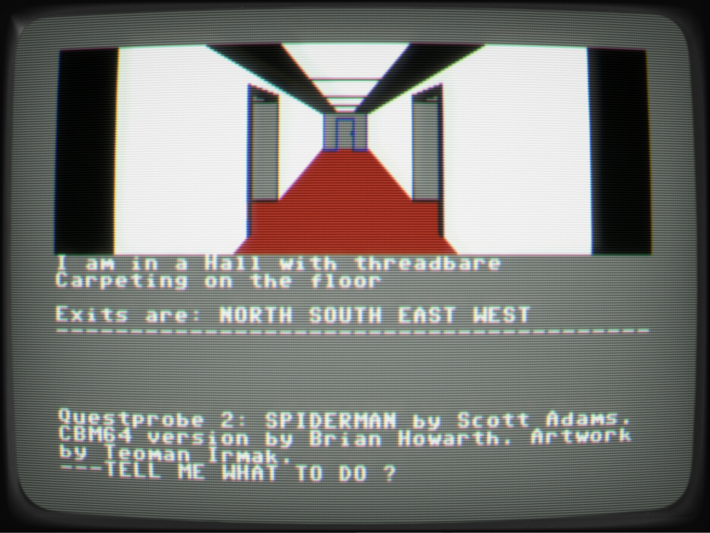
I still feel like there’s something quite fantastic about a game showing a corridor with multiple doors, and you can choose which one to go through. This game was formative for me, for sure 🙂
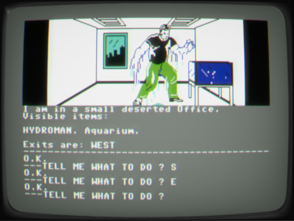
The art is quite basic, the C64 is certainly capable of better than this. But again, the combination of text and pictures was really appealing to me, though I was not a great fan of using text as input (I really struggled with it at the time).
Borrowed Time
Another game that made a big impact on me. I think it was what started my fondness for detective stories. The game is set in the 30s, and it has the hard-boiled detective, gangsters, gunfights… the works.
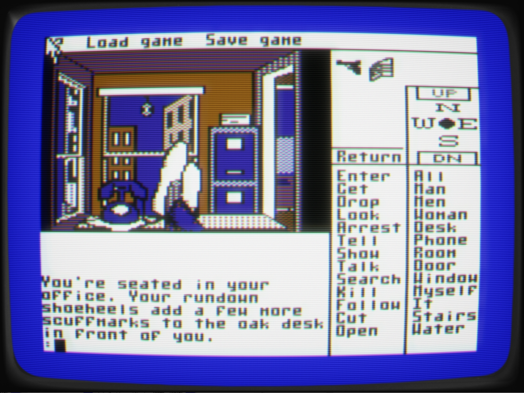
I think this was the first adventure I played where you didn’t have to type everything you wanted to do, You still could type things, but you could also click verbs and nouns on the menu to the right, you had a visual inventory and could navigate with the directional options. When looking at screenshots like this, it is easy to think of controlling the pointer with a mouse. But that was not a common accessory for the C64, so you actually control the pointer with the joystick…
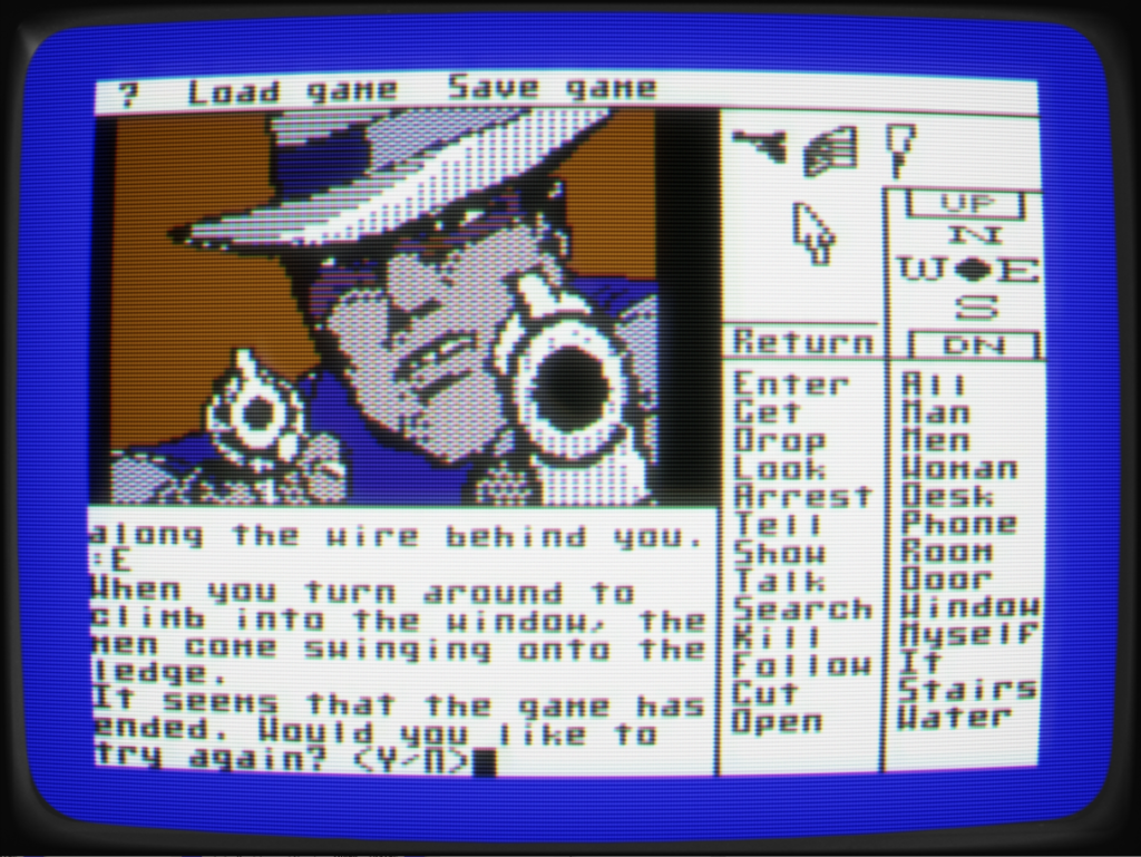
I didn’t mind pictures that only covered parts of the screen, it was worth it to have the menu options and some space for scene descriptions.
The Hobbit
Since I played this quite some time after Borrowed Time, it felt like a step back in some ways. The pictures were prettier (only true for the disk version), but again we have to type everything, I still played it a lot though, being a big fan of The Hobbit since I first read it as a child.
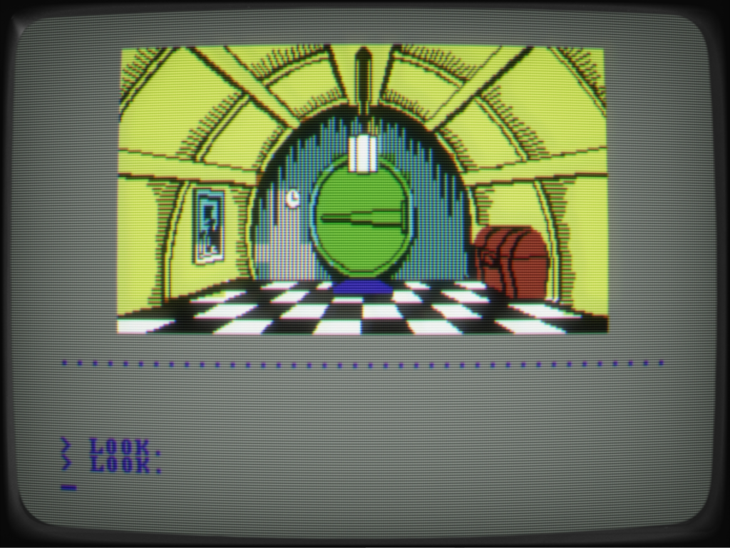
One thing worth noting is this games approach to displaying scene descriptions. Essentially you have to screens you can flip back and forth between, to show the picture or the description, while the lower half holds your input. This gives more room for text while also allowing for big pictures, but I think I prefer slightly less text and smaller images, to not have the back/forth.
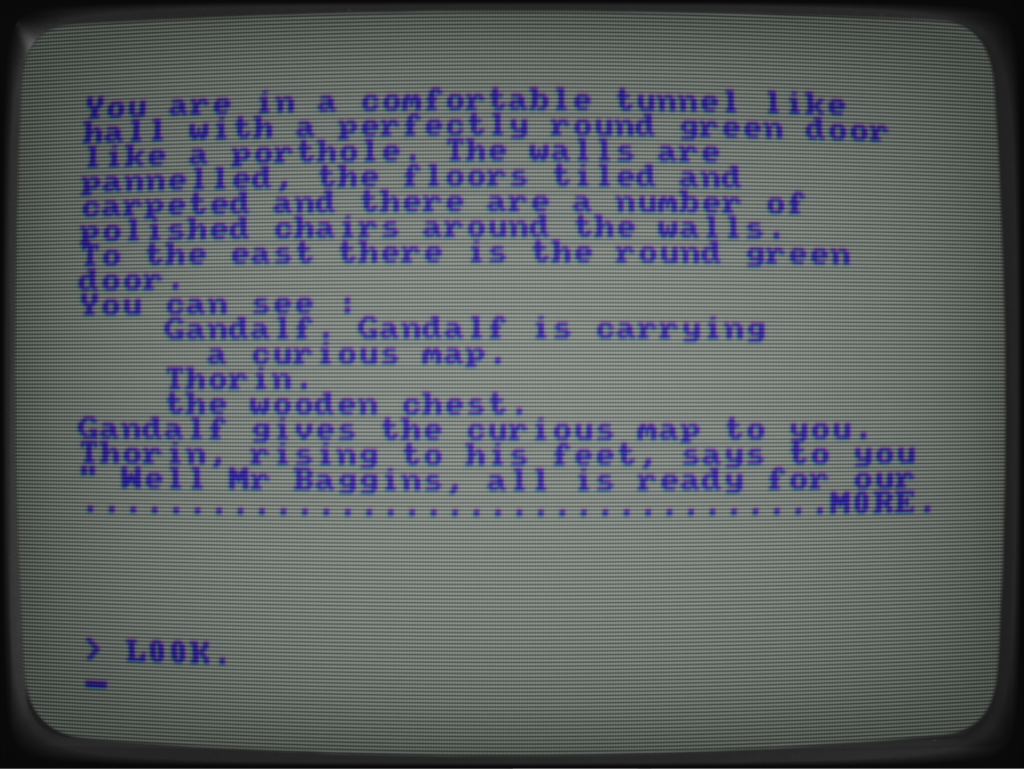
I remember the game had, what they called, a “physics system”, which is admittedly a bit unusual for a text adventure. It mostly meant you could attach objects to other objects, like putting someone in a barrel and then pushing the barrel into a river. It was hilarious, though not very useful, to enter the sequence “pick up gandalf \ throw gandalf in river” and get the response “gandalf floats away”…
Deja Vu
I only had a C64 for a couple of years, before moving on to the Atari ST. It had a lot more colors, but the resolution was the same. I was more into the demoscene on the ST (some of what I did can be seen here) but I also played some games. One of them was this one, another detective story, which by itself was enough to draw me in 🙂
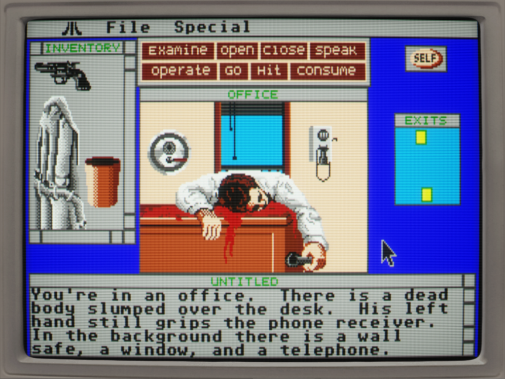
The interface of this game is definitely more involved than the previous ones. It is fully point-and-click, no need to type anymore, which I liked. You could move the UI elements around and resize the windows. I just remember it feeling rather clunky, but certainly a lot of potential.
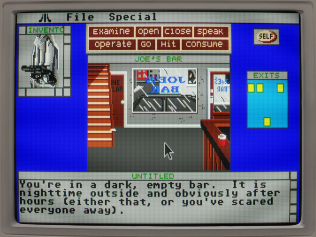
I was never a fan of the amnesia-I-don’t-remember-who-I-am trope in adventure games, so I think that made it a bit more difficult for me to get into it, and with awkward interface, I didn’t get very far into it.
Mortville Manor
I did not have this game myself, but I would play it at a friends house. Anothere detective game, yay! I was immediately very drawn to this – the interface was certainly better than Deja Vu, and the story/setting grabbed me more as well.
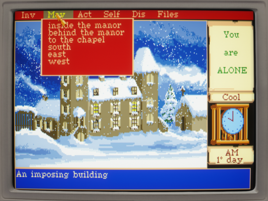
I really like the way they give you options for movements for each scene – you don’t have to worry about north/south/east/west, just which locations are connected. The pull-down menus were a bit cumbersome though, and I think it might have been better to have a smaller picture, and more place for options on the screen.
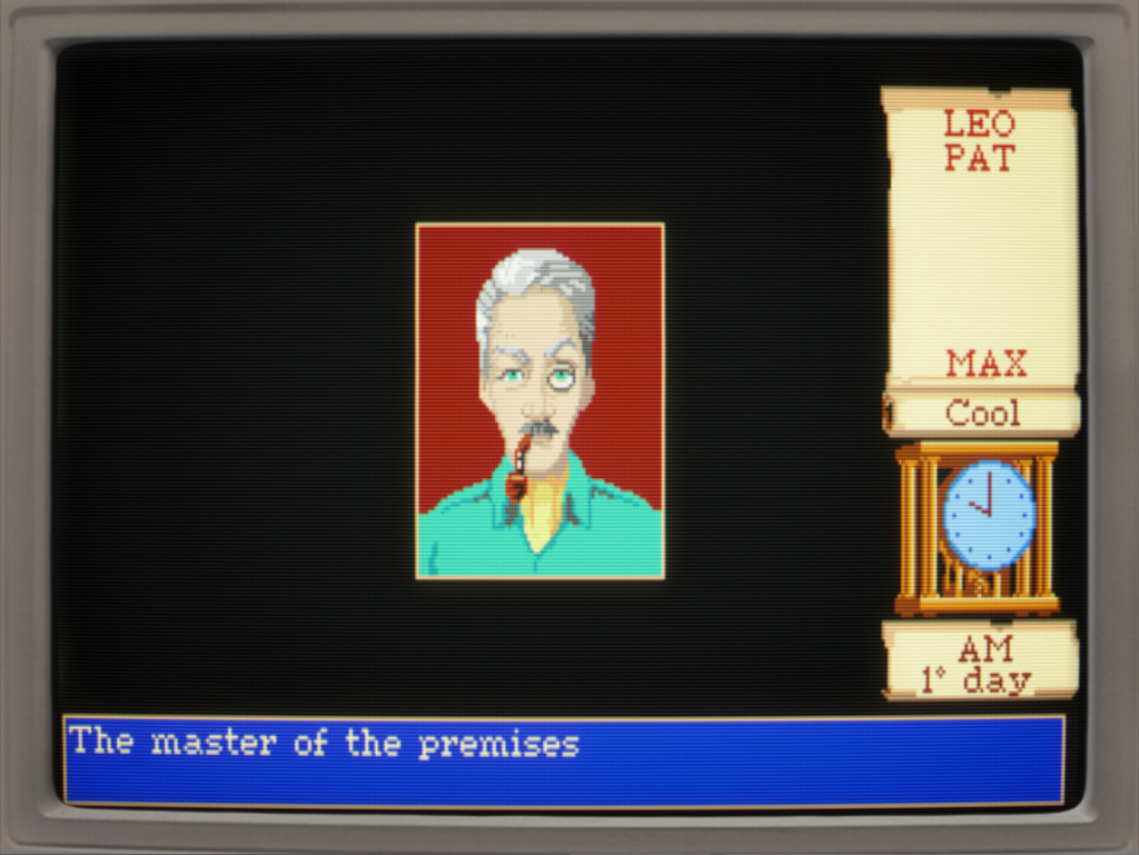
We can really see the influence this game had on the design of Yarnspin. It has the panel which says “You are alone”, or lists the characters in the scene, and when you click on one, you get a dialog screen, with a portrait of the character. But there is no representation of the character in the scene. This is something I think works really well.
Maupiti Island
Another game made in the same engine as Mortville Manor, but it is larger and overall more well made. I love the way this looks, but the UI has the same problems as the previous game.
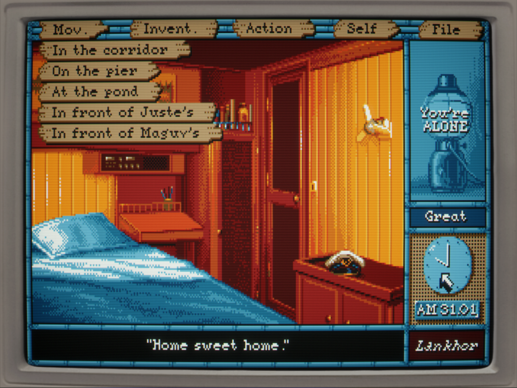
When making Yarnspin, I added support for separate background images for dialogs and locations, as I wanted to be able to do the same thing they do here. I made use of that in the game No Sunshine, to make the dialog screen look like you were making a phone call. I think the next version of the engine will need support for selecting different backgrounds for different characters, to make it more versatile.
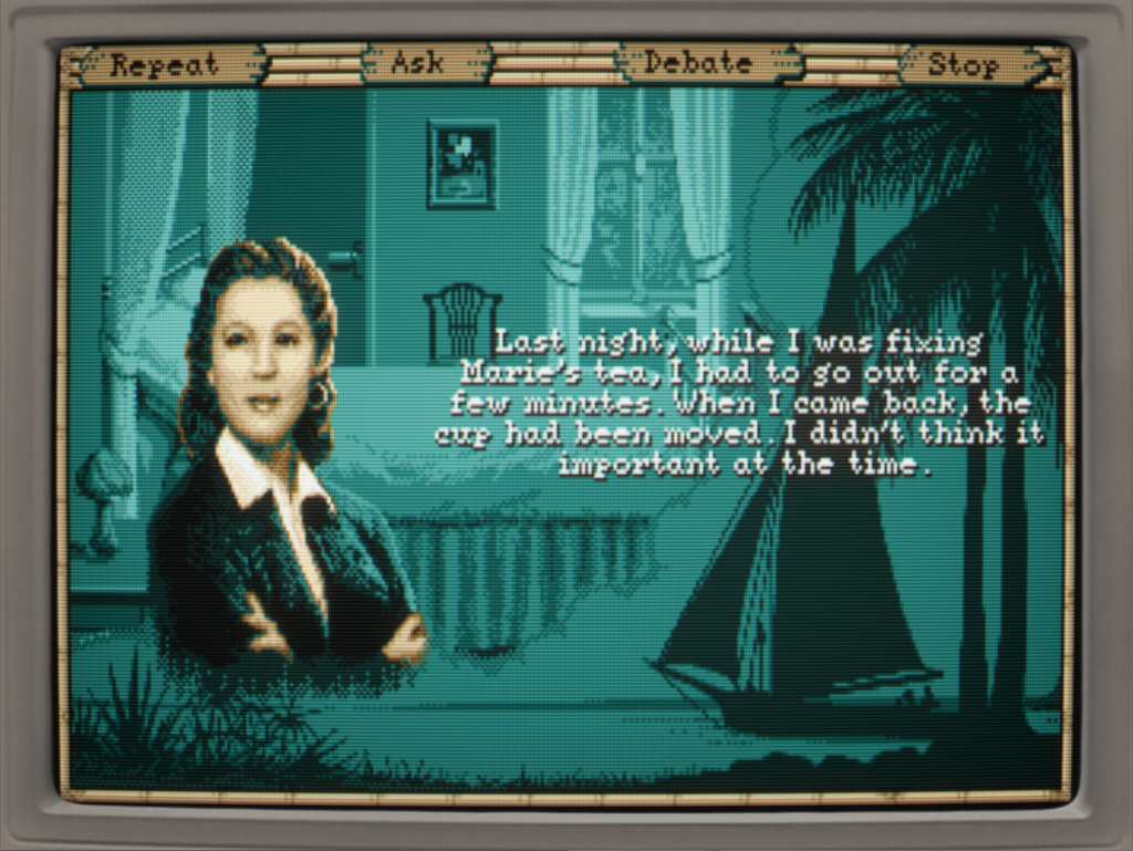
Having backgrounds also means that it would be practical to have text effects like outlines and drop shadows, like they have in this game, so that is something I will definitely add for the next version of Yarnspin.
Point-and-click adventures
I have of course played lots of classic point-and-click adventure as well, such as the Lucasarts games, and hybrids like the Sierra classics. And I love them too, but they feel decidedly different than the type where you have static images and no animation. In a way, the type of games I’ve talked about here feel more immersive to me. Maybe they just engage my imagination in a different way.
Leave a Reply